
Your business sign is more than simply a label in a metropolitan area as diverse and dynamic as Toronto; it’s a first impression, a handshake, and a silent salesman. The font you use can make or ruin your business sign, whether you’re a vintage store in Kensington Market, a fintech firm in the Financial District, or a little café in Leslieville.
While poorly chosen fonts can make a great message seem indistinguishable, well-chosen typography guarantees that your sign will stand out among the urban bustles. Let’s examine how to use these practical typographic tips to grasp readability, style, and regional flair.
Prioritize Legibility Over Trends
- Toronto’s streets are a visual buffet: neon lights in Chinatown, hand-painted murals in Graffiti Alley, and glossy digital billboards in Yonge-Dundas Square. But when it comes to your sign, legibility should always come first.
- Avoid Overly Decorative Fonts: Script fonts like Lobster or Brush Script might look charming up closely, but from a speeding car on the Gardiner Expressway or a distracted pedestrian scrolling on their phone, they’re unreadable. Reserve decorative fonts for accents, not primary text.
- Mind the “Toronto Squint”: Harsh winter glare or summer sun can wash out thin strokes. Opt for medium-to-bold weights, like the font used in the TTC’s signage—simple, thick, and weatherproof.
Size Matters (But So Does Context)
A sign that’s too small fades into the streetscape; one that’s too large overwhelms. Toronto’s mix of narrow historic streets and wide suburban avenues means size needs nuance.
- Follow the 10-Foot Rule: For every 10 feet of viewing distance, letters should be 1 inch tall. A sign 30 feet above Queen Street West? Letters need to be at least 3 inches tall.
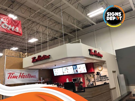
- Adjust for Speed Zones: A drive-thru menu in Scarborough needs larger text than a sidewalk chalkboard in Trinity Bellwoods. The Tim Hortons on Lakeshore uses oversized, no-nonsense typography for drivers grabbing a double-double on the go.
- Print a mockup and view it from different angles. Does it hold up in the shadow of a condo tower at Yonge and Bloor? Can it compete with the Eaton Centre’s visual chaos?
Contrast Is King
Toronto’s weather—from blinding summer sun to gray, slushy winters—can sabotage even the best designs. High contrast ensures your message survives the elements.
- Dark-on-Light or Light-on-Dark: Black text on white (or vice versa) is a classic for a reason. Look at the stark contrast of St. Lawrence Market’s signage—it’s readable rain or shine.
- Beware of Mid-Tones: A trendy charcoal-gray-on-beige combo might look chic in a Queen West studio, but it’ll vanish in fog or snowfall.
- Neon and Backlighting: For 24/7 visibility, consider illuminated signs. The neon glow of “Bar Raval” on College Street impresses nighttime crowds, while the backlit signs at Union Station guide commuters effortlessly.
Kerning and Spacing: The Invisible Heroes
Cramped letters or awkward gaps can turn “CRAFT COFFEE” into “CRAFTCO FFEE.” Proper spacing ensures clarity, especially in multilingual hubs like Toronto.
- Avoid Default Kerning: Fonts like Futura or Gotham often need manual tweaking. The “Toronto” sign at Nathan Phillips Square? Each letter is meticulously spaced for photo-ready clarity.
- Mind Multilingual Needs: In areas like Little Italy or Thornhill, where signs might include accents (e.g., “Caffè” or “Café”), ensure that diacritics don’t collide with letters.
5. Match Typography to Your Brand’s Personality
Your font should whisper (or shout) your brand’s vibe. A Bay Street law firm and a Dundas West punk bar need different typographic energy with Blade signs in Toronto.
- Corporate/Professional: Sleek sans-serifs like Proxima Nova or Montserrat signal modernity. Think RBC’s clean blue-and-white signage.
- Artistic/Creative: Handwritten or serif fonts add warmth. The textural type on “Blackbird Baking Co.” in Leslieville feels as homemade as their sourdough.
- Retro/Nostalgic: Bold, rounded fonts like Cooper Black (used in Toronto’s “Snakes & Lattes” signage) scream playful nostalgia.
Material + Typography = Durability
Toronto’s 20°C winters and humid summers warp materials, so your font choice must work with your sign’s medium.
- Metal and Channel Letters: Laser-cut sans-serifs hold up best. The stainless-steel signs in the PATH underground network use robust, no-frills typography.
- Vinyl Decals: Avoid tiny serifs or intricate details—they’ll peel. The bold, sans-serif decals on food trucks at Toronto’s Waterfront Market survive potholes and rainstorms.
Respect Toronto’s Heritage and Bylaws
Toronto’s heritage districts have strict signage rules. A neon sign on a Victorian brick facade? Probably not.
- Research Local Guidelines: The City of Toronto’s Heritage Preservation Services often mandates historically appropriate fonts with the best sign company in Toronto. For example, a pub in the St. Lawrence neighborhood might need traditional serif lettering.
- Blend Old and New: The “Gooderham Flatiron Building” uses classic gold leaf typography but pairs it with modern LED lighting for nighttime visibility.
At Sign Depot, we’ve spent mastering Toronto’s typographic terrain. From navigating city bylaws to choosing weatherproof fonts, we craft signs that don’t just speak—they resonate. Ready to turn your storefront into a landmark? Let’s contact.