
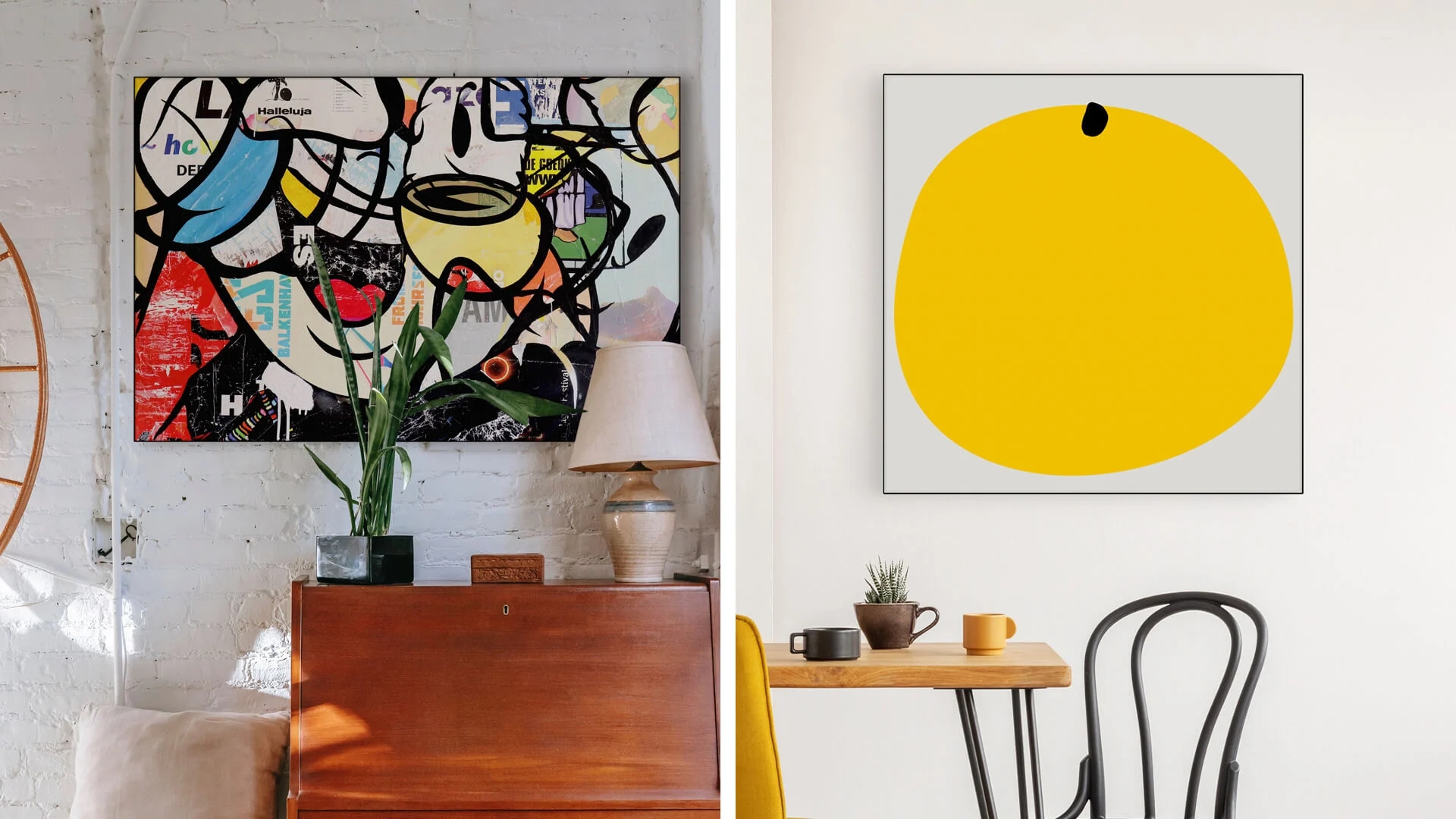
In a city like Toronto, where glass-enclosed skyscrapers and Victorian row houses coexist side by side, minimalism is a sign design that flourishes in areas where simplicity is a powerful tool. The combination of sharp lines, light colors, and significant empty space in these designs convey sophistication. However, bold signs can sometimes be visually appealing.
According to this article, placing the appropriate sign in the correct location might help you influence Toronto’s visual language and potentially raise your company’s brand recognition.
Why minimalism is essential for Toronto:
- Timeless Appeal: In a city that blends old and new, minimalist signs age gracefully. A monochromatic logo on matte steel won’t clash with the brick-and-beam architecture of the Distillery District or the sleek interiors of King West condos.
- Clarity in Chaos: Amid the sensory overload of downtown cores like Yonge-Bloor, a minimalist sign cuts through the noise. Think of tech hubs in Liberty Village—think Shopify’s sleek office signage—where simplicity signals innovation.
- Sustainability: Torontonians value eco-consciousness. Minimalist designs often use durable materials like powder-coated metal or reclaimed wood, aligning with the city’s green initiatives.
Failures of minimalism:
Minimalism walks a tightrope. A poorly executed “simple” sign can come across as cheap or forgettable. Take Queen West’s artsy enclaves: a yoga studio might nail minimalism with a hand-carved cedar sign and a single-leaf motif, but a nearby shop opting for generic Helvetica on a plain vinyl banner could fade into the background. And in high-energy zones like Yonge-Dundas Square? A whisper might get lost in the roar.
The Unapologetic Impact of Bold Signage
Now, let’s talk about Toronto’s showstoppers. Bold signage is the city’s exclamation mark—think neon-lit taquerias in Kensington Market, or the glowing red marquee of the Elgin Theatre. These designs command attention with vibrant colors, oversized typography, and playful shapes. They’re not just signs; they’re landmarks.
Why bold work, and where should it be used?
Instant Recognition: In a city that never sleeps, bold signs act as beacons. The iconic “Honest Ed’s” neon extravaganza (may it rest in retro glory) was a magnet for locals and tourists alike. Today, spots like Super Bargain on Spadina use rainbow-hued block letters to stop scrollers mid-Instagram feed.
Cultural Vibrancy:
Toronto’s diversity demands designs that pop. A bold mural-style sign for a Filipino bakery in Little Manila or neon Punjabi script in Brampton celebrates community pride. Even winter’s grey slush can’t dull a hot-pink storefront.
Emotional Connection:
Boldness triggers feelings. The retro diner vibe of School in Liberty Village, with its glowing yellow sign, evokes nostalgia, while a fitness studio’s aggressive, angular typography pumps adrenaline.
What are the limitations of bold?
Overdo it, and your sign becomes visually static. A cluttered collage of colors and fonts might confuse more than captivate—imagine a College Street storefront where graffiti-style lettering battles psychedelic patterns. Maintenance is another headache: sun-faded vinyl or flickering LEDs can cheapen your brand. And in refined areas like Rosedale? A neon unicorn might clash with the Georgian architecture.
What should guide your choice?
Neighborhood Vibe: Toronto is a mosaic of micro-markets. A minimalist brushed-steel sign suits Ossington’s hipster coffee shops, but head to Scarborough’s strip malls, and you’ll need bold, backlit letters to compete with dollar stores and pho joints.
- Audience Demographics: Millennial professionals in the Financial District might gravitate toward minimalist, app-inspired designs. Meanwhile, Gen Z shoppers in the Eaton Centre respond to TikTok-worthy visuals—think glowing emojis or holographic finishes.
- Architectural Context: Toronto’s heritage regulations can make or break your design. A bold neon sign on a Victorian façade? Prepare for committee reviews. Meanwhile, a glass tower in the Entertainment District offers a blank canvas for digital billboards.
- Weather Resilience: Let’s not forget Toronto’s -20°C winters and humid summers. Minimalist metal signs need anti-icing coatings, while bold vinyl wraps require UV protection to avoid peeling.
Learning from local players:
- Minimalist Mastery: Take Mjölk, a design store in the Junction. Their sign—a subtle, hand-painted Scandinavian-inspired logo on a white brick wall—mirrors their curated, tranquil brand. No frills, all warmth.
- Bold Brilliance: Look at Bar Raval on College Street. Their intricate, Basque-inspired wooden facade, carved with swirling patterns and gold leaf, is a nighttime magnet. It’s art, not just advertising.
Toronto’s creative energy thrives on fusion. Consider a minimalist black-and-white awning sign in Toronto for a bookstore accented by a bold, illustrated mural of a dragon in the window.
There’s no one-size-fits-all answer. A minimalist sign might embody your yoga studio’s zen ethos, while a bubble-tea shop in North York needs rainbow lights to scream fun. The key? Know your brand’s heartbeat and your neighborhood’s rhythm.
At Sign Depot, the best signage company in Toronto, we’ve crafted signs for Toronto’s quirks. From navigating heritage bylaws to choosing frost-resistant materials, we blend local know-how with design flair. Contact us to learn more about the signs that will suit your brand.
In a city like Toronto, where glass-enclosed skyscrapers and Victorian row houses coexist side by side, minimalism is a sign design that flourishes in areas where simplicity is a powerful tool. The combination of sharp lines, light colors, and significant empty space in these designs convey sophistication. However, bold signs can sometimes be visually appealing.
According to this article, placing the appropriate sign in the correct location might help you influence Toronto’s visual language and potentially raise your company’s brand recognition.
Why minimalism is essential for Toronto:
- Timeless Appeal: In a city that blends old and new, minimalist signs age gracefully. A monochromatic logo on matte steel won’t clash with the brick-and-beam architecture of the Distillery District or the sleek interiors of King West condos.
- Clarity in Chaos: Amid the sensory overload of downtown cores like Yonge-Bloor, a minimalist sign cuts through the noise. Think of tech hubs in Liberty Village—think Shopify’s sleek office signage—where simplicity signals innovation.
- Sustainability: Torontonians value eco-consciousness. Minimalist designs often use durable materials like powder-coated metal or reclaimed wood, aligning with the city’s green initiatives.
Failures of minimalism:
Minimalism walks a tightrope. A poorly executed “simple” sign can come across as cheap or forgettable. Take Queen West’s artsy enclaves: a yoga studio might nail minimalism with a hand-carved cedar sign and a single-leaf motif, but a nearby shop opting for generic Helvetica on a plain vinyl banner could fade into the background. And in high-energy zones like Yonge-Dundas Square? A whisper might get lost in the roar.
The Unapologetic Impact of Bold Signage
Now, let’s talk about Toronto’s showstoppers. Bold signage is the city’s exclamation mark—think neon-lit taquerias in Kensington Market, or the glowing red marquee of the Elgin Theatre. These designs command attention with vibrant colors, oversized typography, and playful shapes. They’re not just signs; they’re landmarks.
Why bold work, and where should it be used?
Instant Recognition: In a city that never sleeps, bold signs act as beacons. The iconic “Honest Ed’s” neon extravaganza (may it rest in retro glory) was a magnet for locals and tourists alike. Today, spots like Super Bargain on Spadina use rainbow-hued block letters to stop scrollers mid-Instagram feed.
Cultural Vibrancy:
Toronto’s diversity demands designs that pop. A bold mural-style sign for a Filipino bakery in Little Manila or neon Punjabi script in Brampton celebrates community pride. Even winter’s grey slush can’t dull a hot-pink storefront.
Emotional Connection:
Boldness triggers feelings. The retro diner vibe of School in Liberty Village, with its glowing yellow sign, evokes nostalgia, while a fitness studio’s aggressive, angular typography pumps adrenaline.
What are the limitations of bold?
Overdo it, and your sign becomes visually static. A cluttered collage of colors and fonts might confuse more than captivate—imagine a College Street storefront where graffiti-style lettering battles psychedelic patterns. Maintenance is another headache: sun-faded vinyl or flickering LEDs can cheapen your brand. And in refined areas like Rosedale? A neon unicorn might clash with the Georgian architecture.
What should guide your choice?
Neighborhood Vibe: Toronto is a mosaic of micro-markets. A minimalist brushed-steel sign suits Ossington’s hipster coffee shops, but head to Scarborough’s strip malls, and you’ll need bold, backlit letters to compete with dollar stores and pho joints.
- Audience Demographics: Millennial professionals in the Financial District might gravitate toward minimalist, app-inspired designs. Meanwhile, Gen Z shoppers in the Eaton Centre respond to TikTok-worthy visuals—think glowing emojis or holographic finishes.
- Architectural Context: Toronto’s heritage regulations can make or break your design. A bold neon sign on a Victorian façade? Prepare for committee reviews. Meanwhile, a glass tower in the Entertainment District offers a blank canvas for digital billboards.
- Weather Resilience: Let’s not forget Toronto’s -20°C winters and humid summers. Minimalist metal signs need anti-icing coatings, while bold vinyl wraps require UV protection to avoid peeling.
Learning from local players:
Minimalist Mastery: Take Mjölk, a design store in the Junction. Their sign—a subtle, hand-painted Scandinavian-inspired logo on a white brick wall—mirrors their curated, tranquil brand. No frills, all warmth.
- Bold Brilliance: Look at Bar Raval on College Street. Their intricate, Basque-inspired wooden facade, carved with swirling patterns and gold leaf, is a nighttime magnet. It’s art, not just advertising.
Toronto’s creative energy thrives on fusion. Consider a minimalist black-and-white awning sign in Toronto for a bookstore accented by a bold, illustrated mural of a dragon in the window.
There’s no one-size-fits-all answer. A minimalist sign might embody your yoga studio’s zen ethos, while a bubble-tea shop in North York needs rainbow lights to scream fun. The key? Know your brand’s heartbeat and your neighborhood’s rhythm.
At Sign Depot, the best signage company in Toronto, we’ve crafted signs for Toronto’s quirks. From navigating heritage bylaws to choosing frost-resistant materials, we blend local know-how with design flair. Contact us to learn more about the signs that will suit your brand.