
Think of yourself wandering in the airport to find your gate, but you have to squint at signs as they seem like it was written in ancient runes. Such wayfinding signs in Toronto are going to generate emotions of being lost, mildly panicked, and silently cursing the signages.
But what if your wayfinding system could be less a “maze of despair” and more of friendly signs that comfort you? Such signs don’t just point the way but high-five your brain with clarity. A stellar wayfinding system isn’t just helpful—it’s a sneaky little hero.
In this guide, we’ll crack the code on crafting signs that do more than exist.
Clarity and Readability:
A sign’s primary job is to communicate instantly. If users must squint, pause, or decode hieroglyphics, the system has failed. Getting signs created by the best sign shop in Toronto will suggest you have high-contrast color pairings: black-on-white, white-on-navy, or yellow-on-black. Avoid trendy low-contrast palettes that vanish in glare or shadows.
Font choice is equally critical. Sans-serif fonts like Helvetica, Arial, or Calibri dominate wayfinding for their clean lines and legibility at a distance. Fancy scripts or condensed typefaces might look chic in a brochure, but they’re a liability on signage. Size matters too: For pedestrian signs, 1-inch letter height per 30 feet of visibility is a baseline. On highways, letters balloon to 18+ inches to accommodate speed.
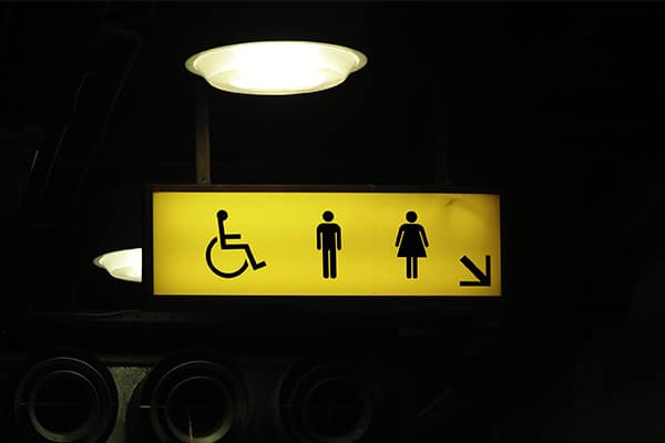
Symbols and pictograms should follow universal standards. A stick-figure running toward a door screams “emergency exit” globally. A wheelchair icon universally signals accessibility. Inventing abstract icons risks alienating users—stick to what’s recognized.
Strategic Placement:
Even the clearest sign is useless if hidden. People glance for cues only when they feel lost. Install signs at decision points: corridor intersections, elevator banks, stairwells, or forks in a path.
Height is a silent dictator of success. For pedestrians, mount signs 60–66 inches above the floor—eye level for most adults. In parking garages or roads, elevate signs to 7+ feet to clear vehicle sightlines. But don’t forget children or wheelchair users: Supplemental lower signs (36–48 inches) ensure inclusivity.
Consistency:
Consistency isn’t just about aesthetics—it’s cognitive shorthand. When users recognize patterns, they navigate on autopilot. Establish rigid design rules.
- Color coding: Assign specific colors to zones (e.g., blue for outpatient, green for diagnostics in a hospital).
- Iconography: Use identical arrow styles, symbols, and spacing across all signs.
- Terminology: Avoid mixing terms like “Restroom,” “Bathroom,” or “WC.” Pick one and stick to it.
Hierarchy of Information:
Not all information is equal. Prioritize urgent needs: exits, elevators, restrooms, and safety info. Secondary details, such as room numbers, office names, come next. Use design tools to signal hierarchy:
- Size: Primary messages (e.g., “EXIT”) are in large font; secondary details are smaller
- Color: Red for emergencies, calming blues for general directions.
- Placement: Critical signs at the top/front of a directory; less urgent info below.
Directories and maps need special attention. Overloading maps with every stairwell and vending machine overwhelms users. Instead, highlight key landmarks.
Accessibility:
- ADA compliance is the floor, not the ceiling. Tactile Braille, raised characters, and proper contrast ratios (4.5:1 for text/background) are legal basics. But true inclusivity digs deeper:
- Cognitive clarity: Use plain language. “Emergency Exit” beats “Egress Point.” Avoid acronyms unless defined. For example, “MRI” is common; “PT/OT” may confuse.
- Lighting: Ensure signs are illuminated in dim areas. Glare-free finishes prevent reflections from obscuring text.
- Multilingual support: In diverse areas, use pictograms and multiple languages. Tourist hubs like airports often list English, Spanish, and Mandarin.
Durability:
A sign’s lifespan depends on material intelligence. Indoor signs in a climate-controlled office can use acrylic or vinyl. Outdoor signs face UV rays, rain, and graffiti—opt for marine-grade aluminum, stainless steel, or UV-resistant polycarbonate.
Matte surfaces reduce glare outdoors, while retroreflective coatings make road signs visible at night. Anti-graffiti laminates or sacrificial layers (e.g., a replaceable film over permanent signage) cut maintenance costs.
Vandalism is a grim reality. Bolt signs securely to walls—avoid adhesive-only mounts. In high-risk areas, use unbreakable substrates or install surveillance cameras nearby.
Digital Integration:
Modern wayfinding isn’t just static signs. QR codes linking to interactive maps, apps with turn-by-turn navigation, or AR overlays (e.g., holding a phone up to see virtual arrows) enhance the experience. However, digital tools should supplement, not replace physical signage. Not everyone has a smartphone, signal, or tech literacy.
A flawless wayfinding system feels effortless. It is like an unseen hand guiding users where they need to go. By prioritizing clarity, anticipating human behavior, and embracing adaptability, you create not just signs but confidence. You can contact Signs Depot to get a sign that will make them remember the ease of getting from A to B. In a world where stress-free navigation is rare, that’s a competitive edge worth investing in.