
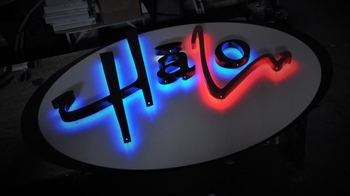
Halo-lit signs are the most prominent signs that give an enthralling look to capture the right audiences for businesses. Creating a glowing halo effect around the letters makes your signs look professional, improving branding visibility 24/7.
However, you need to wisely choose the right font and style to maintain the efficiency of these signs. An improper font will not only hamper readability but also won’t be able to convey the right brand identity. As a result, the overall impact of your sign will be diminished.
This article highlights what factors you need to consider while choosing the perfect font and style for your halo-lit signs in Toronto.
1. Understand Your Brand Identity
First, you need to understand your business’s identity before selecting the font. The right font should complement the brand style and the core message that you want to portray. It should also follow the rules and regulations of your zonal municipality.
- Luxury brands: If you operate luxury brands, you may choose stylish, professional and serif fonts like Baskerville or Garamond.
- Modern businesses: If you are into the modern business sector in Toronto, fonts like Helvetica or Futura give a contemporary look and feel.
- Creative industries: If your business belongs to the creative sector, you might experiment with decorative fonts to give a unique presence.
2. Prioritize Readability
Consider the readability of halo-lit signs before their installation. They should be visible even from afar throughout the day and night.
- Avoid overly decorative fonts: Though cursive and handwritten fonts look stylish, they are not readable completely, particularly in a halo-lit format.
- Choose a balanced font weight: Don’t choose fonts that are too thin, as it could be difficult to illuminate them well. Thick fonts may grab more attention in the halo effect.
- Opt for clean lines: Fonts that have clean lines and clear shapes may be ideal for optimum visibility.
Some popular fonts that you can consider are,
- Helvetica
- Arial
- Futura
- Gotham
- Century Gothic
3. Consider Font Size and Letter Spacing
Pay attention to the size and letters of the fonts when you want to create the halo lighting effects.
- Font Size: Larger letters are clearly visible even from a distance; similarly, you may not get clarity with tiny fonts, especially when lit up.
- Letter Spacing (Kerning): Use the spacing properly between the letters. Too little spacing can cause the halo effect to merge between letters, giving blurred vision.
4. Choose the Right Materials and Finishes
Pick the right materials and finishes that are suitable with the font and style.
- Brushed aluminium or stainless steel: These materials provide a sleek and stylish look for your business.
- Acrylic letters: Do you run a modern business? Acrylic letters will not only give you a chunk of customized options but also give your brand a modish look.
- Matte finishes: with this kind of finish, the halo effect remains soft and subtle.
5. Select the Right Halo Lighting Color
You need to cautiously select the color to maximize the halo lighting effect. Different colors portray various emotions and inspire customers to make the right purchase decisions.
- White: Classic, clean, and professional.
- Warm White/Yellow: Creates a vintage or rewarding feel.
- Blue: It is suitable for tech companies and corporate brands.
- Red: If you need immediate attention, choose this color.
- Green: It conveys your business is eco-friendly and sustainable.
6. Test Different Font & Style Combinations
Try to be experimental before finalizing the right fonts and styles. You need to see how they look when illuminated. The best signage company in Toronto offers mock-ups or 3D renderings to visualize how the sign will appear in real-world settings.
You can request a demo to see and understand how your selected font and style work well with the halo lighting.
7. Compliance with Local Signage Regulations
Not every zone in Toronto follows the same rules and regulations when it comes to signage. Check your locality’s guidelines and restrictions on signage styles, colors, or sizes. If you don’t follow the guidelines, you may face a hefty penalty at any time from the local authorities.
Conclusion
You need to select the right fonts and styles to maximize visibility for your halo lit signs. Well-lit signs uplift brand recognition and aesthetic appeal.
By paying attention to readability, suitable materials, ideal lighting color, and brand alignment, you can create effective signs for your business in Toronto.
If you need professional assistance and guidance for halo-lit signage, contact Signs Depot. We will offer tailor-made solutions after thoroughly analyzing your requirements. Our expertise in design and installation will ensure that your brand possesses a professional and visually striking illuminated sign. Our company also offers other signage solutions like channel letters, sign boxes, trade show displays, and wall mural signs in Toronto.
Do you want to accelerate the look of your storefront with the perfect halo-lit sign? Get in touch with Signs Depot today!