
Yard signs in Toronto are fleeting messengers in a fast-paced world. Whether announcing a campaign, sale, or event, these signs have mere seconds to stop a passerby from scrolling thumbs or slow speeding cars and catching wandering eyes. The difference between a sign that fades into the background and one that commands attention is the strategic design. Fonts and colors aren’t just about looking pretty; they’re tools to slice through the chaos of busy Toronto streets. A bold, no-nonsense font means your message gets read in a split second, even by someone stuck in Queen West traffic.
Why Fonts and Colors Make or Break Your Message
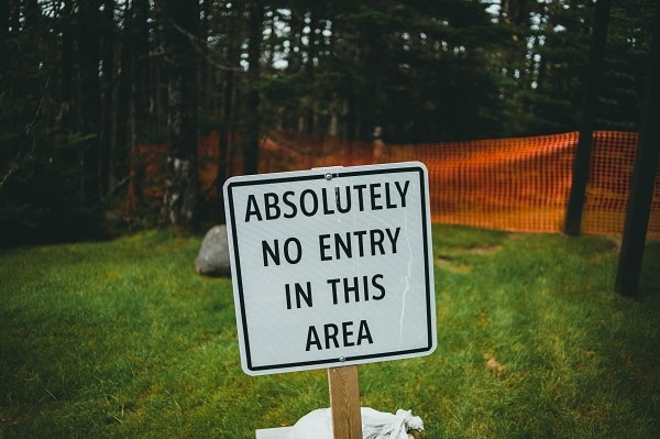
Sans-serif fonts like Helvetica or Impact dominate yard sign design for a reason: their clean lines are readable from 30+ feet away. Pair them with colors that pop. For example: Think black-on-yellow or red-on-white to create urgency and clarity. Avoid decorative fonts or pastel palettes that vanish in sunlight or blend into surroundings. Every choice, from letter spacing to color psychology, shapes how your sign is perceived. The goal is to design so sharp and simple that it’s impossible to ignore. After all, the best yard signs don’t just share information—they demand action.
Here are some suggestions for fonts, colors and designs that can help you design an exterior signs in Toronto that can help you get attention.
Avoid Fancy or Script Fonts
While cursive fonts like Lobster or decorative typefaces might look elegant up close, they’re a nightmare to decipher from a moving car. Save them for wedding invitations, not yard signs.
Size and Spacing Matter
Even the best font fails if it’s too small. Aim for letters at least 3 inches tall for visibility from 30+ feet. Avoid overcrowding text, stick to 7 words or fewer and use ample spacing between lines.
Color Psychology: Trigger Emotions, Not Eye Strain
Go bold, so your sign won’t vanish into lush lawns or condo grayscapes. Avoid pastels (they fade) and neon (too harsh). Skip muted colors like gray/beige, as they disappear outdoors. The right combinations evoke emotions, reinforce branding, and ensure your sign stands out against its surroundings (think green lawns or busy streets).
Top Color Combinations for Yard Signs
Black on Yellow
This high-contrast duo is the gold standard for visibility. Yellow screams urgency (think traffic signs), while black text pops boldly. Ideal for safety alerts or sale announcements.
Red on White
Red triggers excitement and urgency, making it perfect for political campaigns or limited-time offers. Pair it with a white background for crisp contrast.
Navy Blue on White
Navy exudes trust and professionalism. Realtors and businesses often use this combo to appear credible without overwhelming viewers.
White on Forest Green
Green symbolizes growth and tranquility. Pairing it with white text creates a fresh, eco-friendly vibe for community events or landscaping services.
Bright Orange on Deep Blue
Orange is energetic and fun, while blue balances it with stability. Great for festivals or sports team spirit.
Colors to Avoid
- Pastels or Neon: Pale pink or mint green may look pretty but fade in sunlight. Neon colors like lime green can vibrate against certain backgrounds, causing eye strain.
- Low-Contrast Pairings: Gray on beige or red on black might match your brand palette, but they’ll blend into the environment.
- Maximizing Impact: Contrast and Layout Tips
Even the best fonts and colors won’t save a poorly designed layout. Follow these rules to ensure your sign gets seen:
Prioritize Contrast
Dark text on light backgrounds or vice versa ensures readability. Test your design by squinting at it. If the text disappears, boost the contrast.
Use Borders Strategically
A 1–2 inch border in a contrasting color (e.g., white around a red sign) frames your message and prevents blending into the background.
Keep It Simple
Avoid cluttering your sign with logos, images, or multiple fonts. Stick to one or two typefaces and let negative space guide the eye.
Consider the Environment
A bright yellow sign might get lost in a desert landscape, while a green sign could vanish in a grassy park. Scout the location and adjust colors accordingly.
Here are some examples of what might work for your exterior signs in Toronto.
Political signs thrive on urgency, a red text on white with bold Impact font demands action.
For a real estate business opt for navy blue/white pairings and sleek Futura to whisper professionalism.
Similarly, for community events, have soft green backgrounds with crisp white Helvetica to radiate approachability. Each combo shows visibility with emotion, leaving no room for guesswork. Match your goal to the design with the best sign company in Toronto, and your sign won’t just inform; it’ll connect.
Ready to make your message impossible to ignore? Trust Signs Depot to craft yard signs that command attention. With decades of expertise in color psychology, font selection, and durable materials, we turn ideas into eye-catching realities. Don’t settle for generic designs, partner with a team that knows how to make your sign stand out in any setting. Contact SignsDepot today for a free design consultation.